
CME develops new brand identity for demolition contractor
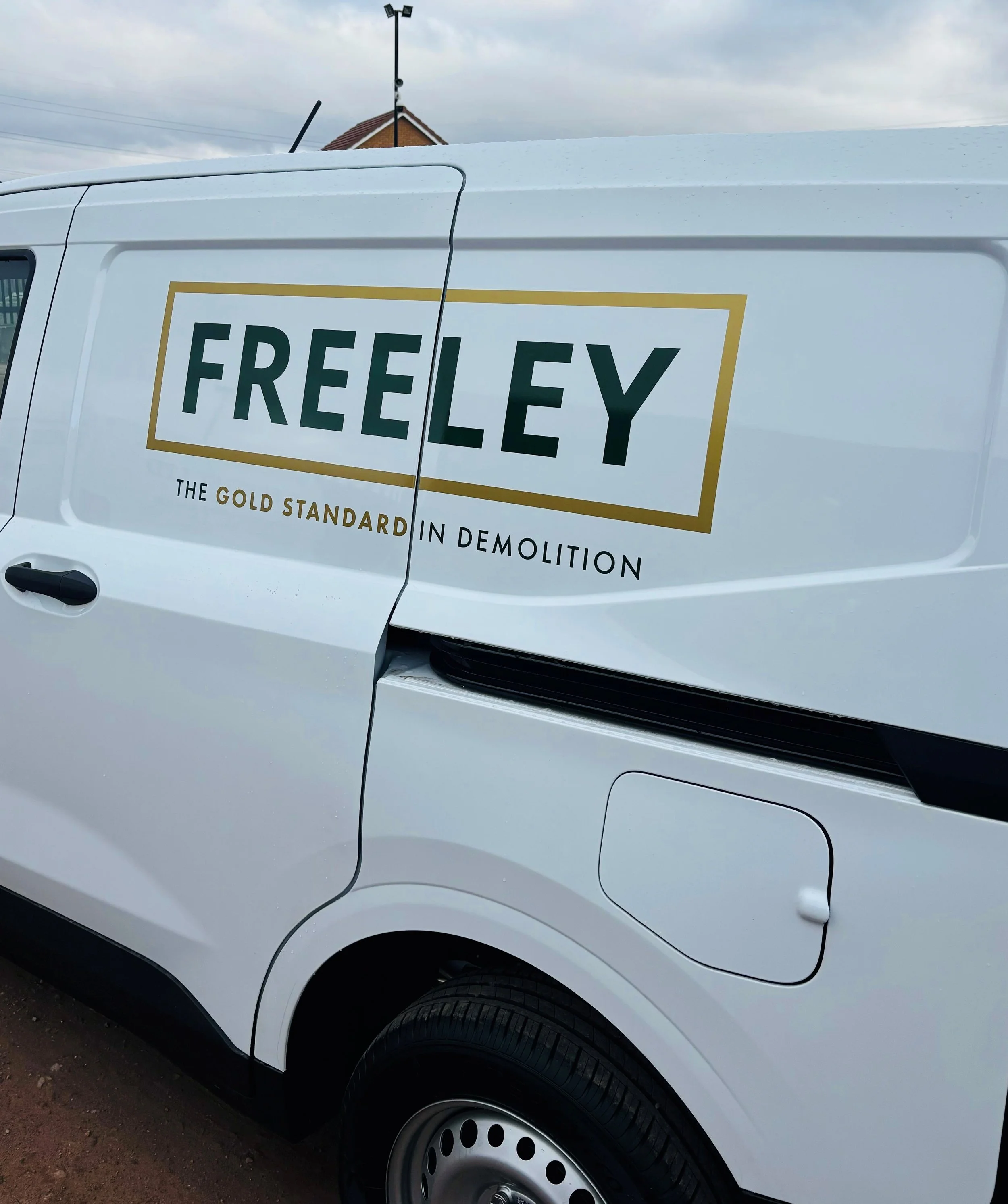
New Freeley van design.
CME has helped a leading demolition contractor refresh its brand, honouring its 40-year heritage and strong reputation.
The project has seen J Freeley rebrand to Freeley with a new logo, strapline and colourway reinforcing the company’s reliability and professionalism.
As the foundation of the new identity, the Freeley logo has a new font, spaced lettering and matt gold finish, providing a more confident and contemporary appearance. The brand’s signature green colour, which has been synonymous with the business since it was established in 1983, acknowledges its strong history.

The new strapline - ‘the gold standard in demolition’ - captures Freeley’s commitment to going above and beyond.
“As we continue to evolve and strengthen as a business, it’s important our brand reflects both our history and future ambitions,” said Director Michael Freeley. “Our new identity achieves this through a simple yet powerful design reflecting our strengths and aim to set a superior standard.”
As part of the rebranding exercise, CME also supported Freeley in refining its core values to reflect its ongoing commitment to excellence.